Posted by: WebHobbit | June 1, 2014

That Smell

kirby-royer-conway

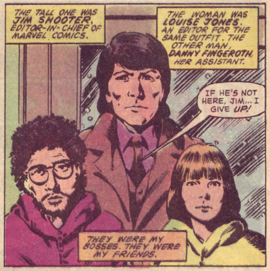
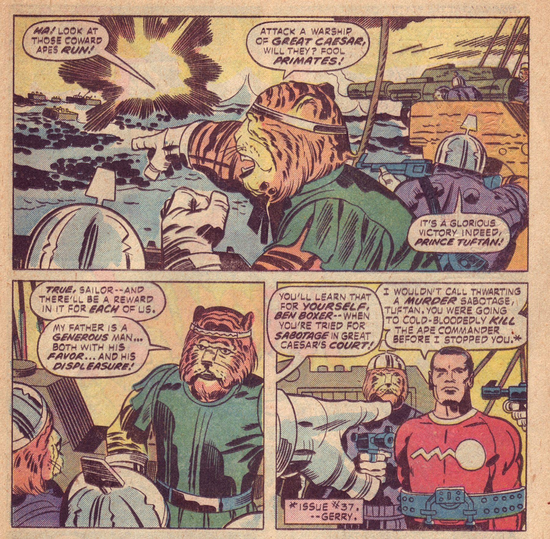
The above scan is from Kamandi #39 from 1976. The art is by Jack Kirby with inks and letters by Mike Royer. Unlike most of the issues that came before it this one is written by Gerry Conway rather than Kamandi’s creator Jack Kirby. I bring this gem up because I was recently smelling some old comicbooks….that’s right SMELLING them and at once I was reminded of my first taste of Kirby’s solo creations…..and quite possibly one of the first comics I ever read period. It’s really strange and wonderful the way certain smells can take you back to a certain moment in time. I worked with a guy that had little to NO SENSE of smell. It never seemed to bother him much. But it sure would bother me! As I I’ve mentioned before I LOVE the smell of pulpy book paper….comic paper being my favorite but old paperbacks being a close second (almost the same paper really). I remember buying this issue. I must have been about 8 years old since this was some time in the summer of 1976 (I think). I was with my parents at a fishing lake. Despite his best efforts my Dad couldn’t interest me much in fishing. Although I was somewhat interested in the big worms I was NOT too happy about skewering them on a hook! It was on a trip to the bait shop to get said worms when I discovered that Kamandi comic on a creaky wire-frame spinner rack. I talked my Dad into adding this 25 cent purchase to whatever the cost that container of worms was and we headed back to our spot at the lake. I didn’t spend too much time with the fishing rod after that as I was wrapped up in discovering a brand new crazy sci-fi fantasy world of Kirby creations! And I was hooked for life. It makes for a good story and that is how I remember it but it may or may not have been my very first comicbook.

Things have really changed with comics. The distribution is a tiny trickle of what it once was. Younger generations of readers I’m sure don’t even remember when you could find new comics almost EVERYWHERE. They were in every gas station, drug store, grocery store and even in a lot of bait shops as I found out that day in 1976. I’m NOT against web-comics or reading them on the various tablets and smart-phones but they just don’t do it for me. Not the same feel….and NOT the same SMELL.

Posted by: WebHobbit | March 19, 2014

Claremont’s Man-Thing Run

I recently finished reading Chris Claremont’s Man-Thing run. Claremont began writing Man-Thing when Marvel revived the book in 1979. The original series by comics writing legend Steve Gerber ended in 1975 after 22 weirdly wonderful issues. Reading these issues some 35 years later I thought Claremont had HUGE shoes to fill. Also I thought this a pretty ODD choice for Man-Thing. Although I am a fan of Claremont’s work – especially his X-Men stuff I’ve always thought of him as a Team Book kind of guy. Strangely enough as a comics fan my first exposure to Marvel’s Man-Thing was an issue of Claremont’s run that I bought new off the stands when I was about 11 years old (1979). I didn’t really discover the greatness of the Gerber originals until years later when I could afford to buy them as back issues.

The first half of the 11 issue Man-Thing volume 2 was a bit of a chore to get through as Claremont at his worst can be a little verbose and a bit “over-narrative”. He seemed to take a little while to really figure out how to write Man-Thing comics. It’s too bad the title only made it to issue 11 though as about half way through this run things started to get really good! Claremont brought back many of the Gerber created supporting characters including Dakimh the Enchanter, Thog the Nether-Spawn, Jennifer Kale & Captain Fate. Stuff genuinely started clicking and the book was fun again. These last few issues are also a great reminder at how good Claremont wrote strong female characters. Long before Joss Whedon’s Buffy or Rob Thomas’s Veronica Mars Chris Claremont was writing his own quirky yet powerful female heroes. In his Man-Thing books Claremont transformed the once spoiled rich girl Barbra Bannister into a human avatar of Death. Sounds like a villain I know but yet she still helps save the world!

MT11-Mayerik-Wiacek-BB

I always love it when a series (TV or comics) give us a proper ending instead of just STOPPING. Marvel really delivered with the ending of this one. Claremont pulls out all the stops and ties up all the dangling plot lines and even writes himself into the story just like Steve Gerber did back in Man-Thing volume one’s last issue. Here he is drawn by Val Mayerik in issue 11’s opening page (click for larger):

MT9-Hanna-Bulanadi-Claremont

He even wrote some of Marvel’s bullpen into the book. Here is Val Mayerik’s take on editors Danny Fingeroth, Jim Shooter and Louise Jones (now Simonson):

MT11-Mayerik-Wiacek-Bullpen

I love everything about Man-Thing volume 2’s last issue. Claremont’s run ends on a high note -great art and a fantastic story with a satisfying ending. Check out the tear in Man-Thing’s eye just below the issue number on the cover (click for larger):

mt2-11

Posted by: WebHobbit | March 9, 2014

It’s Time

starts

So I’m reading through the comments here:

http://arstechnica.com/information-technology/2014/03/windows-8-1-update-1-more-interface-concessions-that-still-wont-make-people-happy/?comments=1&start=80

And I’m at once heartened and a little surprised that so many people are thinking (and saying/typing) the same things I have been. I have shied away from the whole debate about the original Start Menu’s value (for the most part anyway) because as I have always said I just don’t use the Start Menu that much as I prefer to use the Task Bar to pin my most used programs. But I have to say that the old Start Menu while not PERFECT by any stretch is simply BETTER by a magnitude of about a BAZILLION than that Tile World Monstrosity that smart folks like Peter Bright (DrPizza) and Paul Thurrot keep trying to tell me how great it is.

THE START SCREEN SUCKS !!!!!!!

It’s needlessly complicated to organize, extremely space inefficient, silly looking and I’m pretty sure it might have murdered my parents in an alley after an opera on a moonlit night!

waynes

I think it’s time MS stopped fiddling around trying to improve this colossal failure of UI/UX and RIP IT OUT by it’s multicolored hair follicles! If they would just spend a TINY bit of time improving the Original Start Menu itself it could scale MUCH better to differing amounts of installed apps. Instead they just keep on chasing this unicorn of a touch-pad/desktop hybrid OS that virtually NO ONE WANTS except MS in it’s maniacal and ultimately misguided lust of the “iPad market-share”.

It’s time Microsoft got back to what it does best and just sit down and make the best Desktop Operating System they can, cede the tablet market to Apple and Android and call it a day. After all they can still make a mint selling software and services to ALL markets!

« Newer Posts - Older Posts »

Categories